SwiftUI에서 ViewModifier 를 이용하여 Custom View를 만드는 방법
SwiftUI Custom View Modifiers
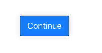
Create Custom Button
- 아래와 같은 Custom button view를 생성하려면
struct CustomButton: View {
    var body: some View {
        Button(action: {
            print("select button")
        }, label: {
            Text("Continue")
                .font(.system(size: 16))
                .foregroundColor(.white)
                .padding(.horizontal, 14)
                .padding(.vertical, 10)
                .background(Color.blue)
                .overlay(
                    RoundedRectangle(cornerRadius: 3)
                        .strokeBorder(style: StrokeStyle(lineWidth: 1))
                        .foregroundColor(Color(.sRGB, red: 0.1, green: 0.1, blue: 0.1, opacity: 1))
                        .cornerRadius(4)
                        .shadow(color: Color(.sRGB, red: 0, green: 0, blue: 0, opacity: 0.5), radius: 5, x: 0, y: 0)
                )
        })
    }
}
Using Modifier
- 위와 동일한 결과를 아래와 같이
ViewModifier를 통해서 구현할 수 있다.
struct CustomModifierButton: View {
    var body: some View {
        Button(action: {
            print("select button")
        }, label: {
            Text("Cancel")
                .modifier(ButtonModifier())
        })
    }
}


struct ButtonModifier: ViewModifier {
    func body(content: Content) -> some View {
        return content
            .font(.system(size: 16))
            .foregroundColor(.white)
            .padding(.horizontal, 14)
            .padding(.vertical, 10)
            .background(Color.green)
            .overlay(
                RoundedRectangle(cornerRadius: 3)
                    .strokeBorder(style: StrokeStyle(lineWidth: 1))
                    .foregroundColor(Color(.sRGB, red: 0.1, green: 0.1, blue: 0.1, opacity: 1))
                    .cornerRadius(4)
                    .shadow(color: Color(.sRGB, red: 0, green: 0, blue: 0, opacity: 0.5), radius: 5, x: 0, y: 0)
            )
    }
}
Using Modifier added state parameter
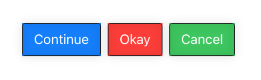
- 만약 각각 다른 background color를 가진 버튼에 style을
ViewModifier로 구현하고 싶다면 - 아래와 같이 구현할수 있다.
struct ButtonModifier: ViewModifier {
    @State var backgroundColor = Color.red
	...
- 추가로 fontSize같은 value도
@State변수로 추가할 수 있다. - 전체 sample code
struct ModifierStackView: View {
    var body: some View {
        HStack {
            CustomBlueButton()
            CustomRedButton()
            Button(action: {
                print("select button")
            }, label: {
                Text("Cancel")
                    .modifier(ButtonModifier(backgroundColor: .green))
            })
        }
    }
}

struct CustomBlueButton: View {
    var body: some View {
        Button(action: {
            print("select button")
        }, label: {
            Text("Continue")
                .modifier(ButtonModifier(backgroundColor: .blue))
        })
    }
}

struct CustomRedButton: View {
    var body: some View {
        Button(action: {
            print("select button")
        }, label: {
            Text("Okay")
                .modifier(ButtonModifier(backgroundColor: .red))
        })
    }
}

struct ButtonModifier: ViewModifier {
    @State var backgroundColor = Color.red

    func body(content: Content) -> some View {
        return content
            .font(.system(size: 16))
            .foregroundColor(.white)
            .padding(.horizontal, 14)
            .padding(.vertical, 10)
            .background(backgroundColor)
            .overlay(
                RoundedRectangle(cornerRadius: 3)
                    .strokeBorder(style: StrokeStyle(lineWidth: 1))
                    .foregroundColor(Color(.sRGB, red: 0.1, green: 0.1, blue: 0.1, opacity: 1))
                    .cornerRadius(4)
                    .shadow(color: Color(.sRGB, red: 0, green: 0, blue: 0, opacity: 0.5), radius: 5, x: 0, y: 0)
            )
    }
}